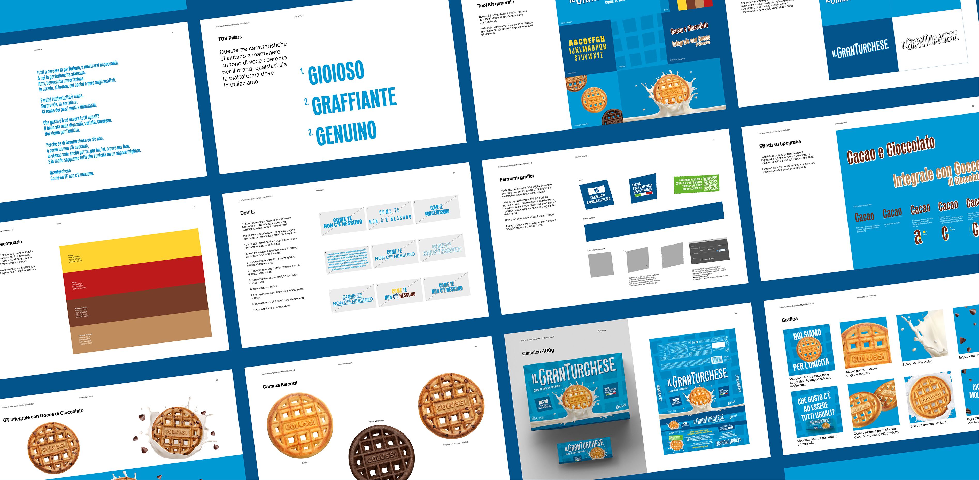
Colussi

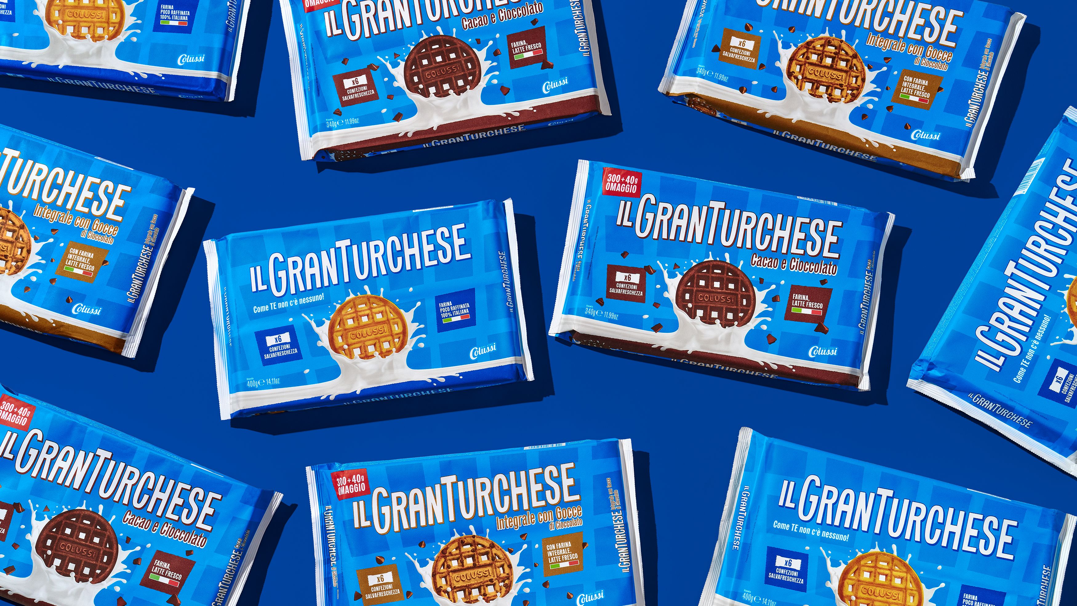
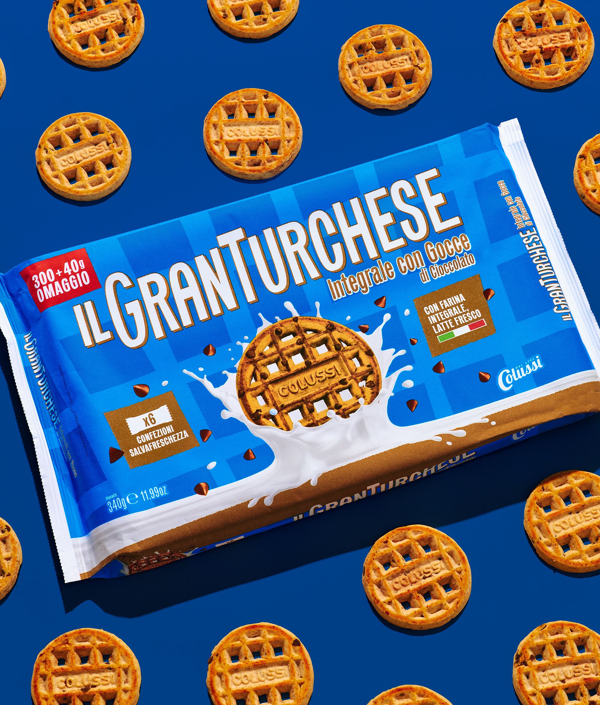
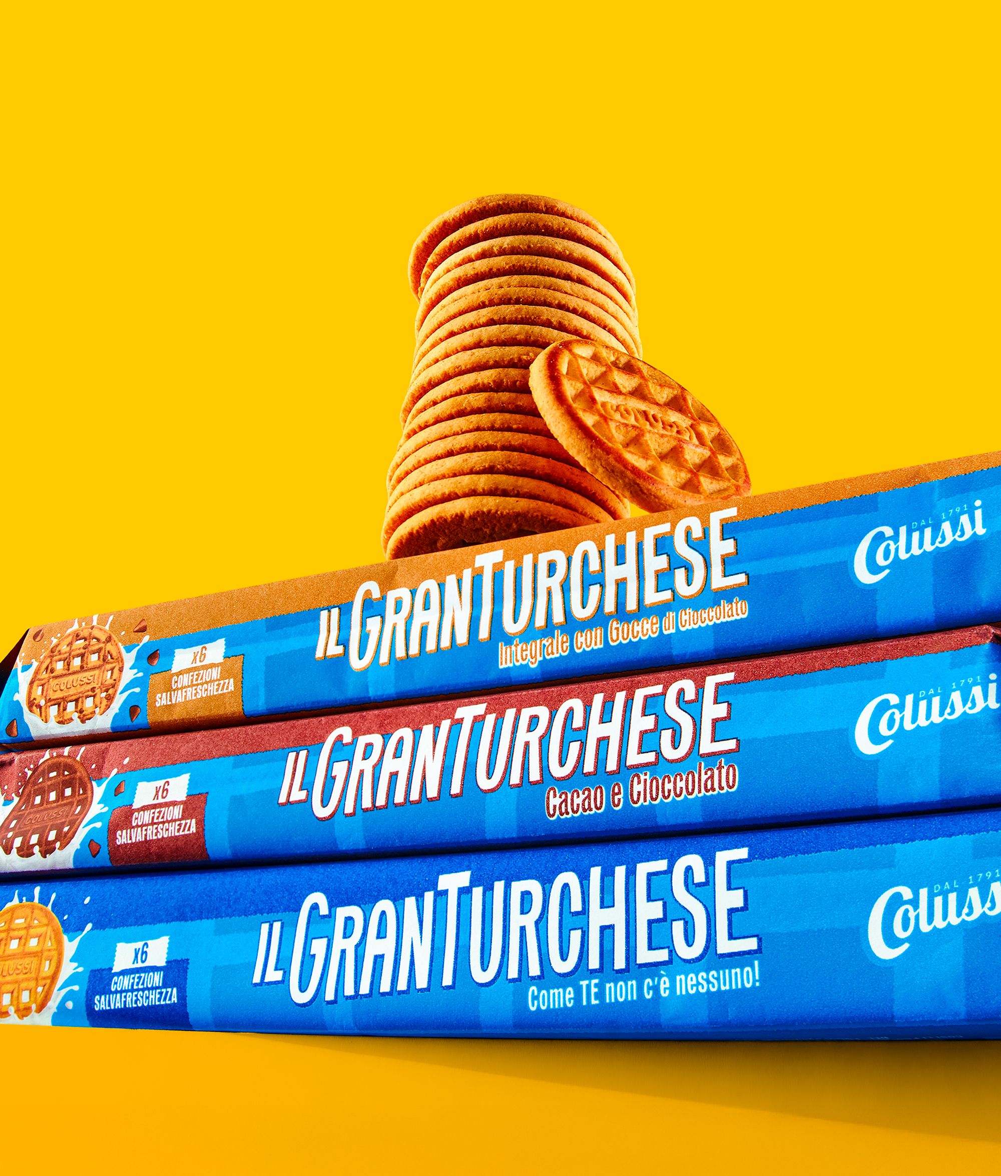
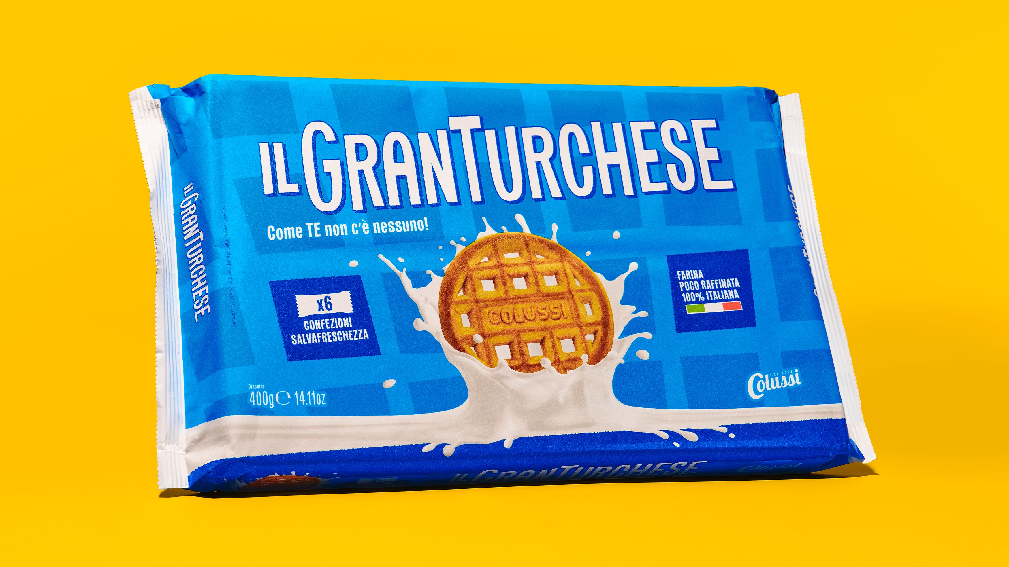
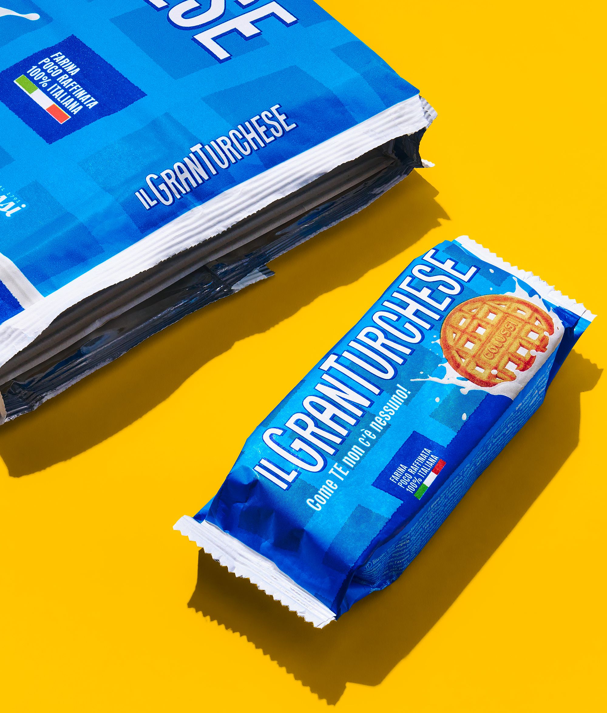
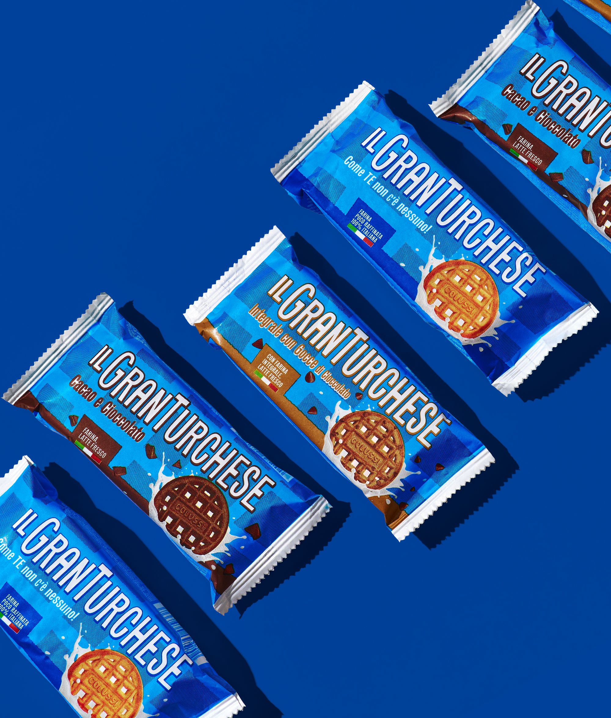
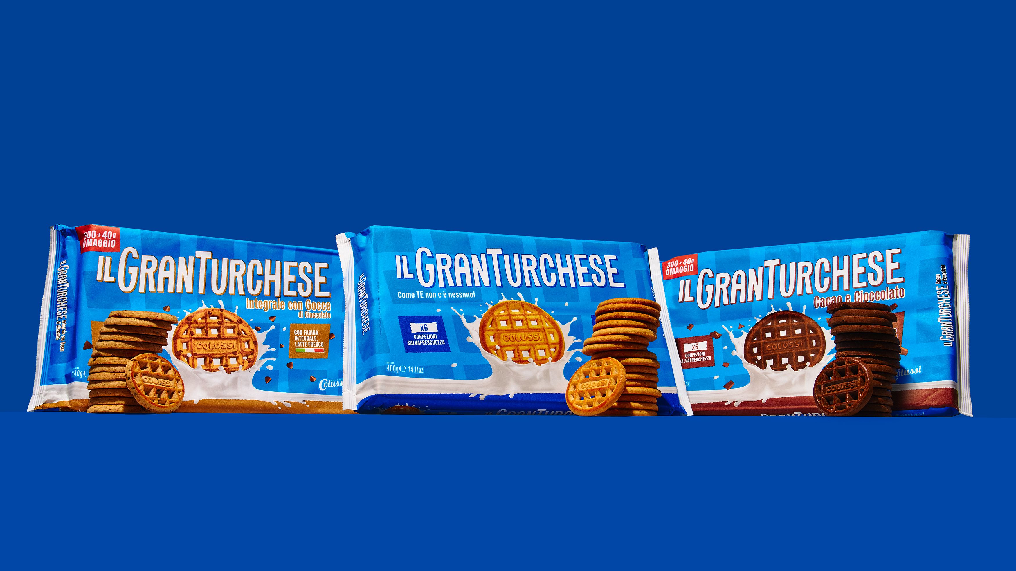
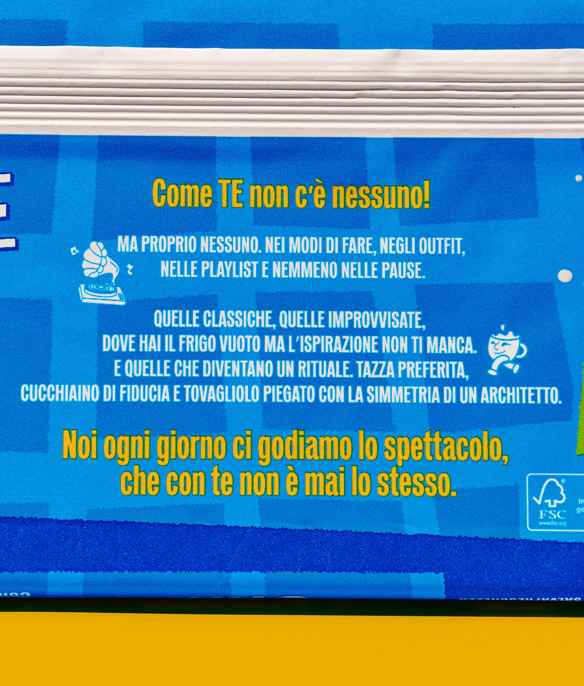
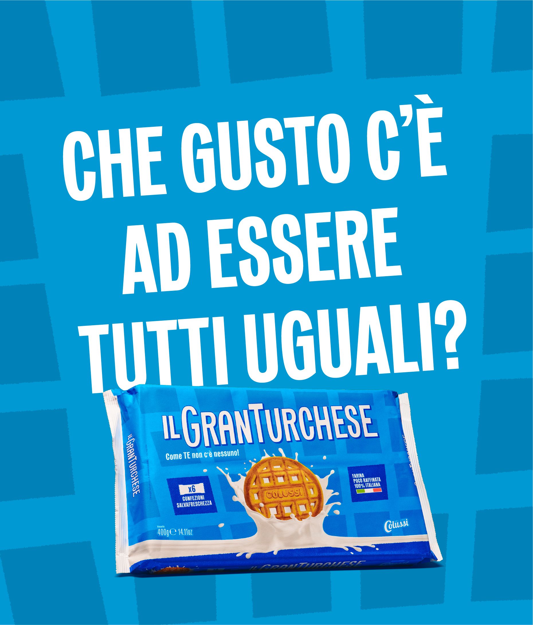
GranTurchese . Come te non c'è nessuno!

  • Graphic Design
  • Packaging
  • Branding

Your breakfast is unique. You are unique.
So the new packaging had to be too.

We’re not all the same. And GranTurchese knows it. That’s why the brand is back with a message—and a new look—that celebrates real uniqueness. The new positioning aims to establish GranTurchese as a standalone brand, supported by a refreshed visual identity and updated packaging. Designed to be flexible and ready for future product lines, the restyling brings a more modern, impactful, and recognizable presence on shelf.

GranTurchese’s new visual identity starts with a refreshed logo—now more balanced, readable, and harmonious—while the iconic turquoise remains at the heart of the brand.

The biscuit takes center stage, shown through a cleaner and more engaging image.

A key design element is the grid: imperfect by choice, it visually reflects the texture of the biscuit.

The new packaging features this tone-on-tone grid to create a direct and distinctive connection with the product.

The redesign extends beyond the pack, evolving into a full visual identity system.

A new graphic language has been developed to unify and characterise all brand touchpoints and communication assets.