Royal Unibrew

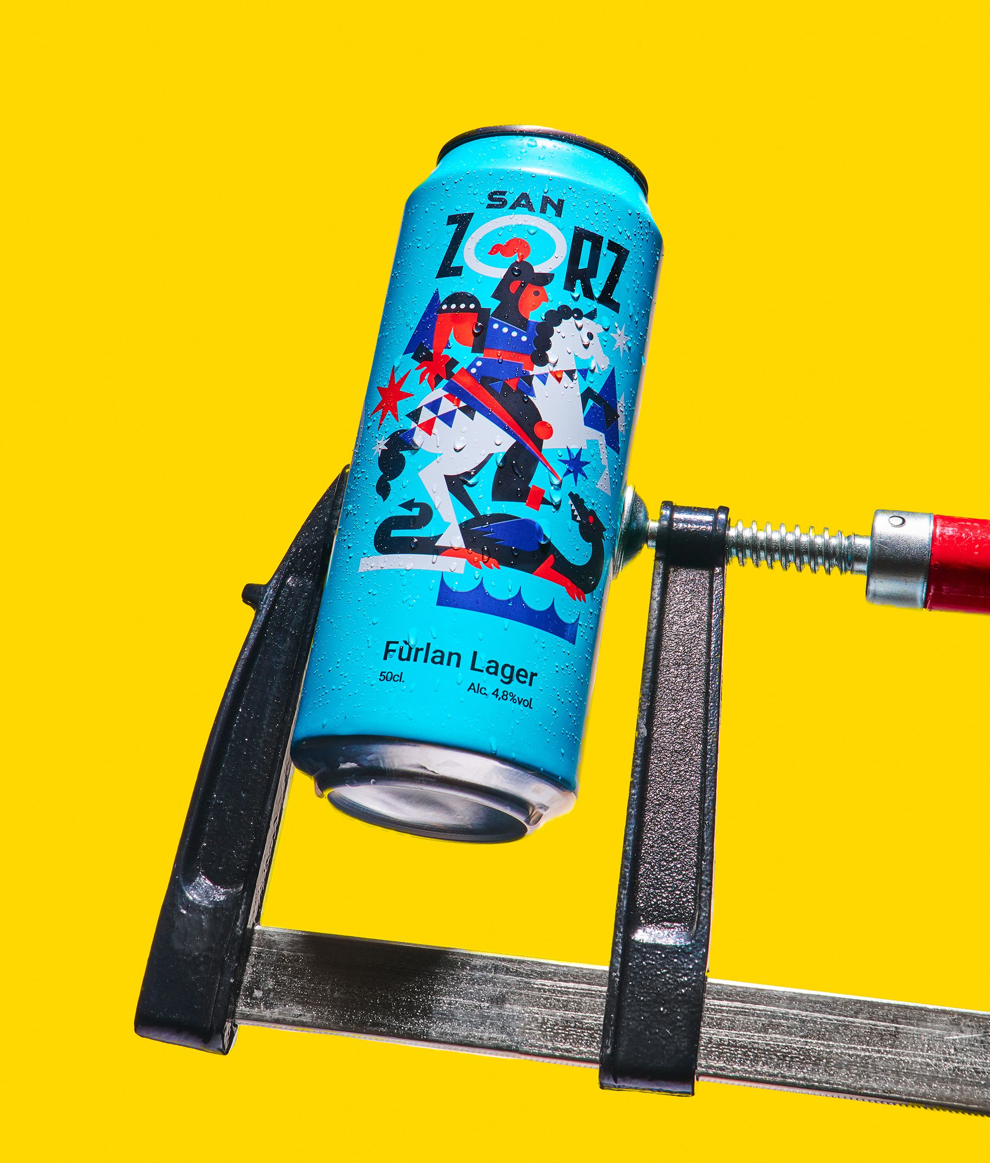
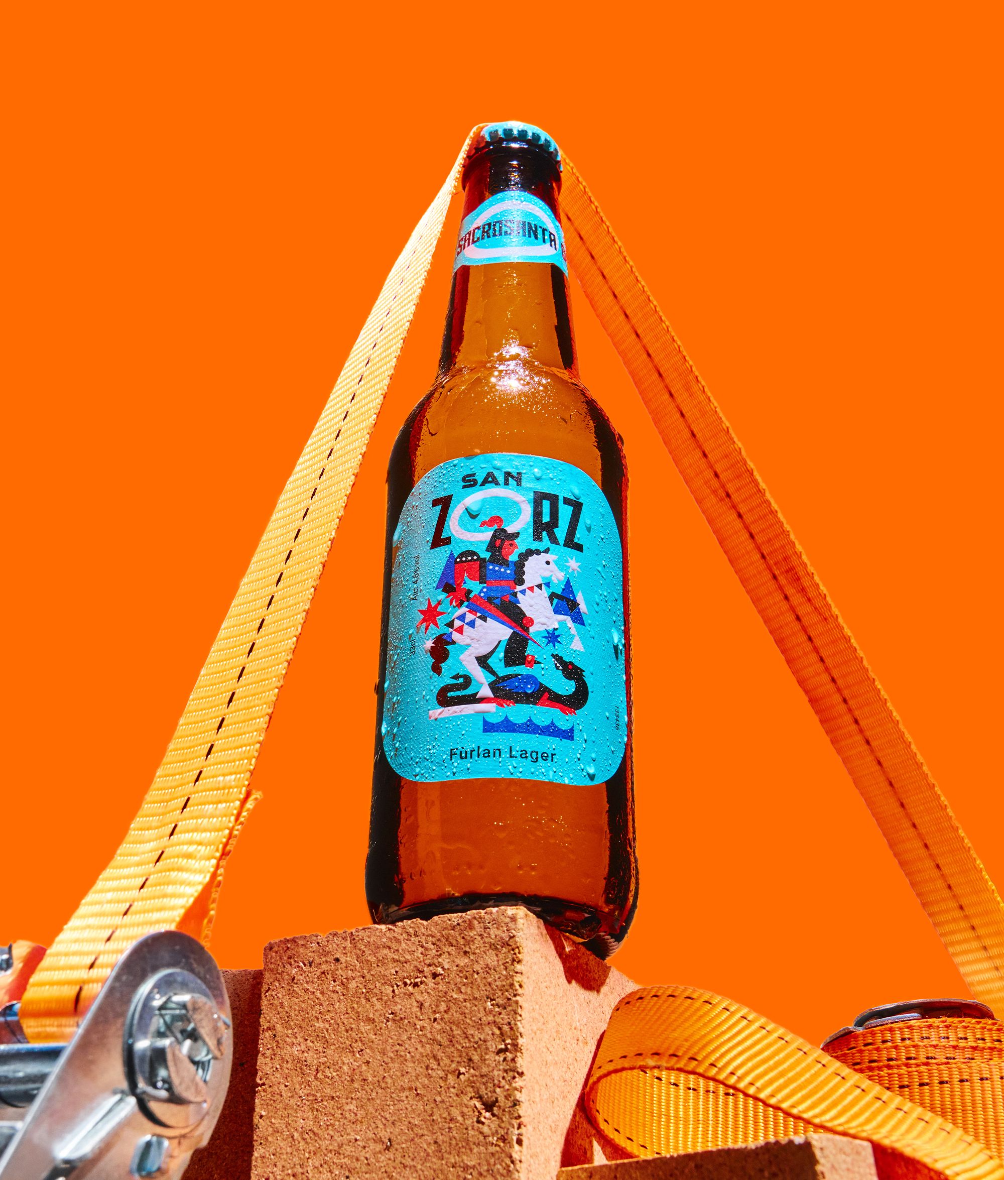
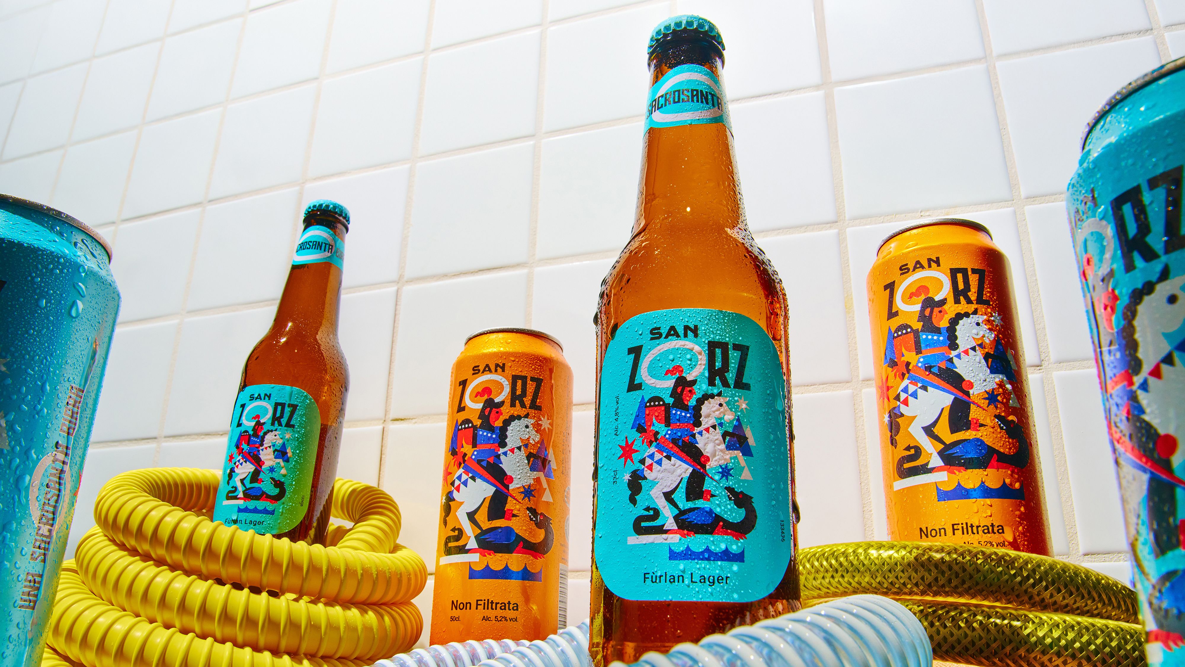
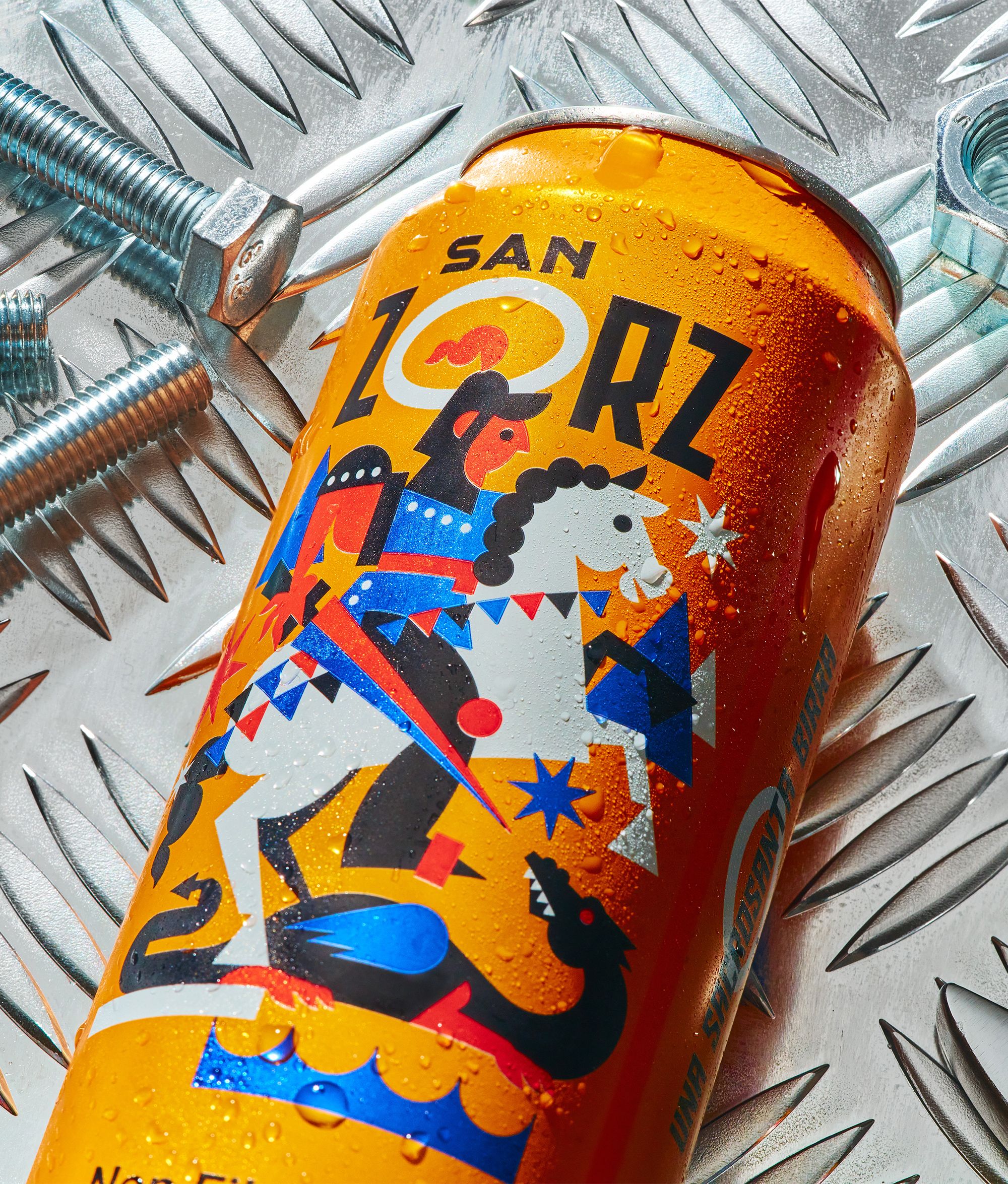
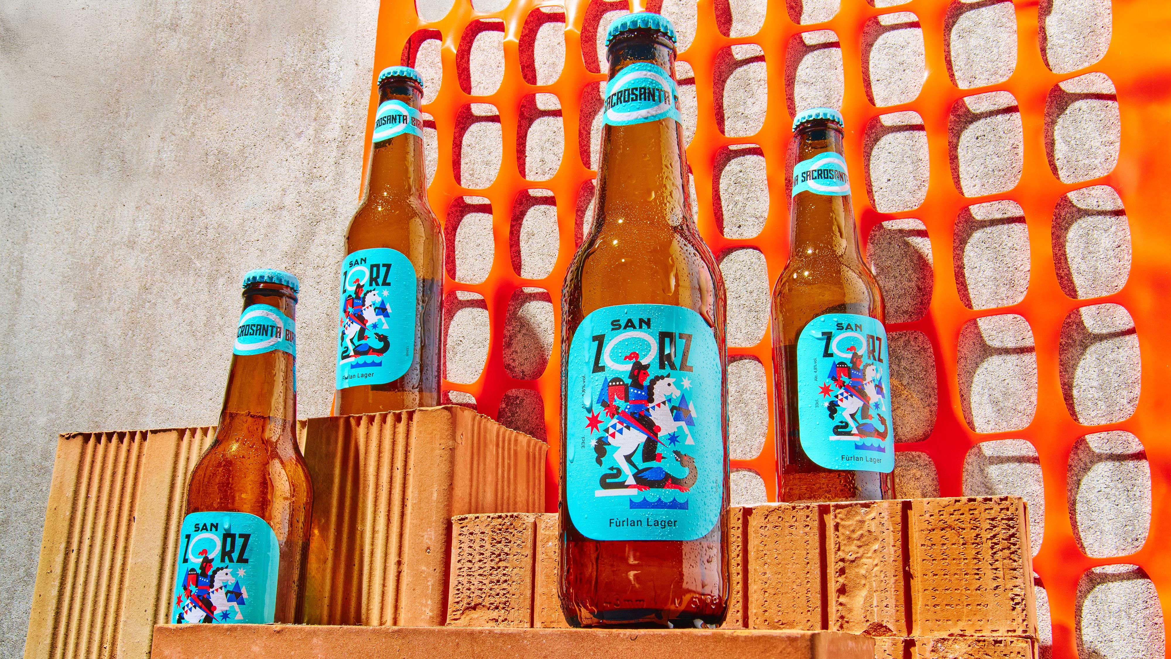
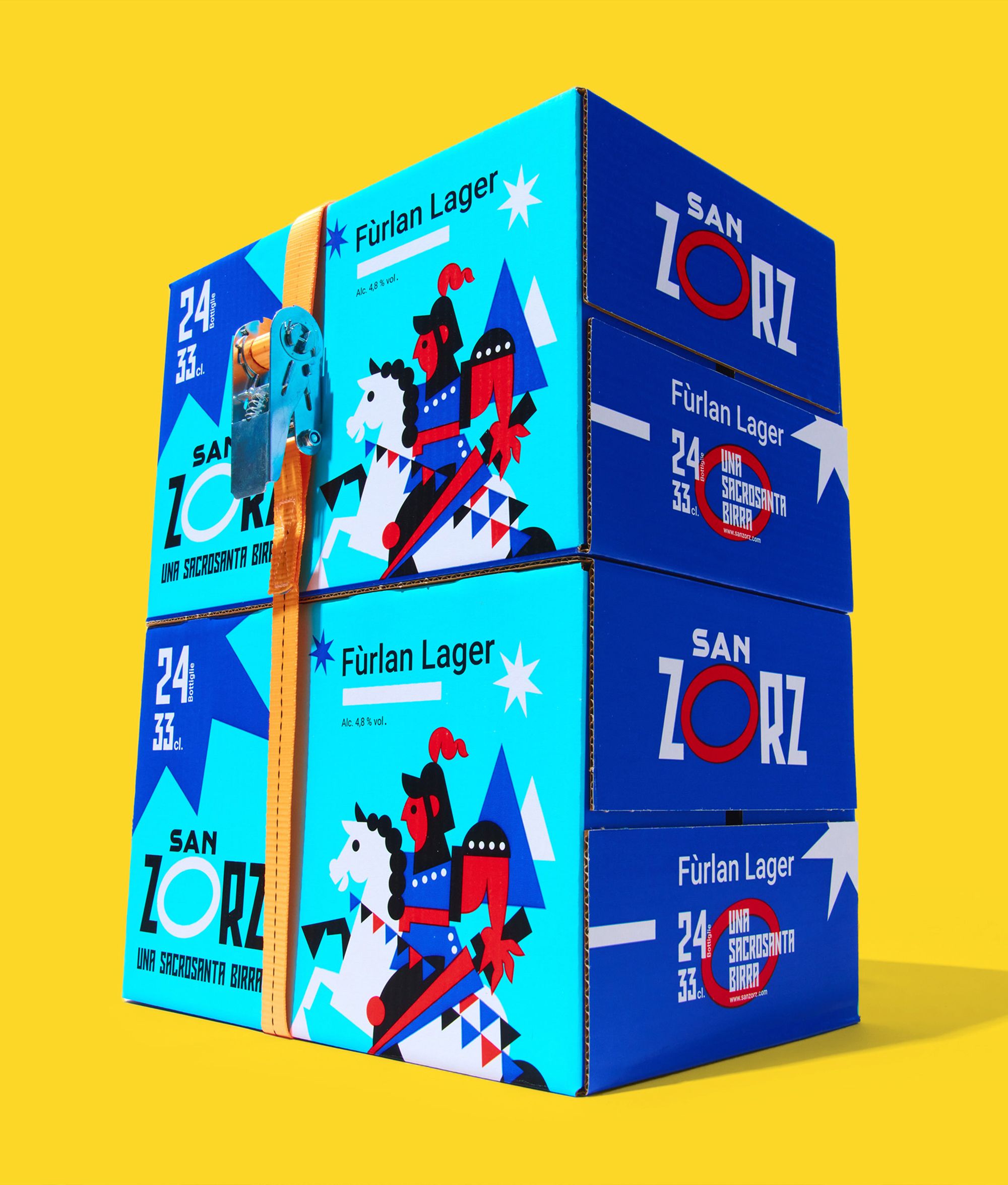
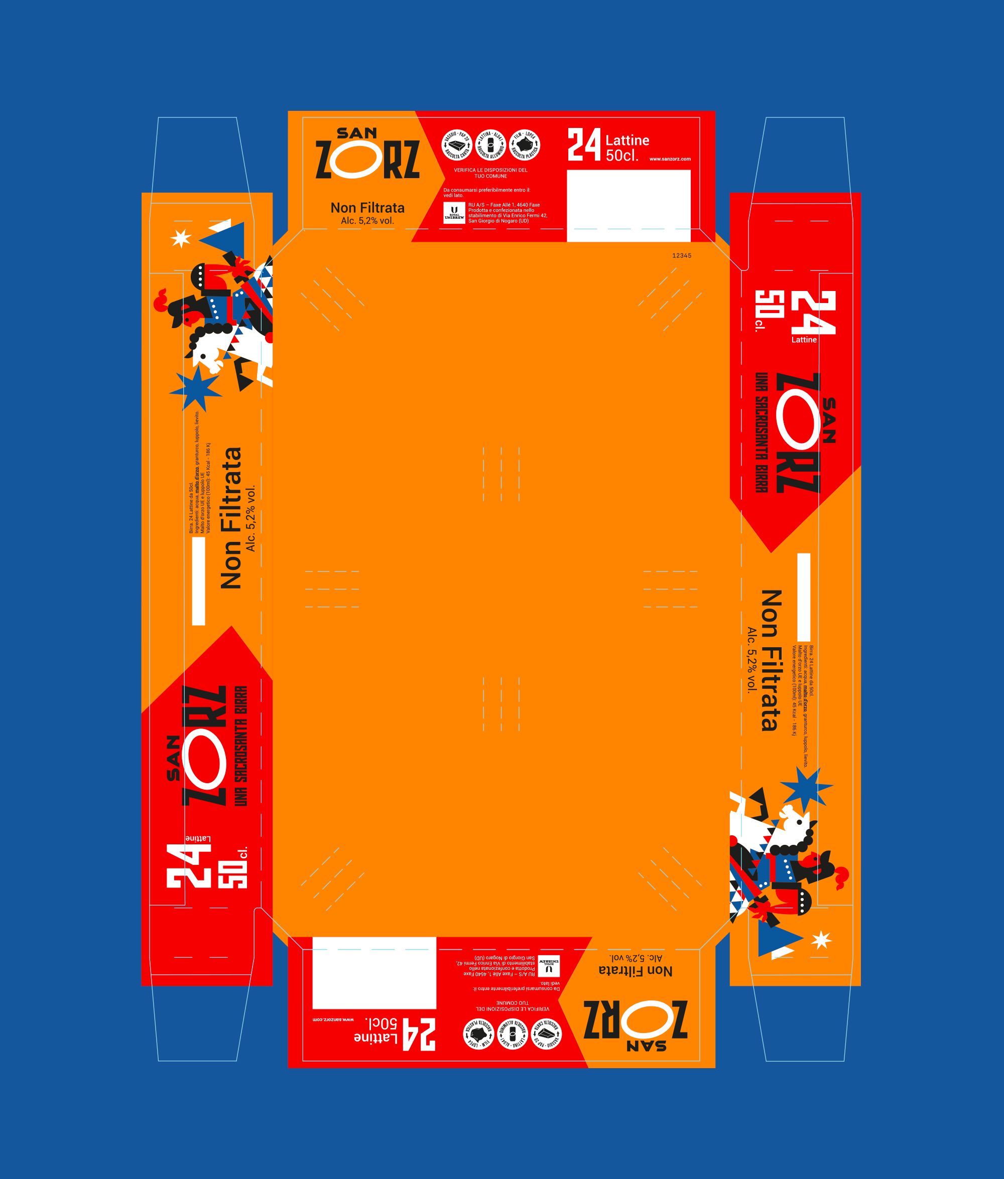
San Zorz . Una sacrosanta birra

  • Branding
  • Graphic Design
  • Packaging

Good, fresh, and just right to enjoy after a long day of work. Simply, a holy damn beer.

Royal Unibrew's vision is clear: to create a beer that speaks the language of the land where it is born and embodies its deepest values — honesty, simplicity, and dedication to hard work. A tribute to Friuli and the brewery where this beer comes to life.

The branding of ‘San Zorz’ highlights its hyper-local roots, with the name itself being a phonetic take on ‘San Giorgio’ in the Friulian dialect—familiar and friendly, like a local voice at the bar.

The logo subtly incorporates St George’s halo into the letter ‘O’, reflecting the region’s spiritual heritage. The legend of St George slaying the dragon, long depicted in traditional art, has now been reimagined in a pop-art style for the first time appearing on beer bottles and cans.

Through thoughtful use of colours, shapes, and symbols, the design captures a sense of nature, pride, and resilience, creating a distinct and locally resonant identity.