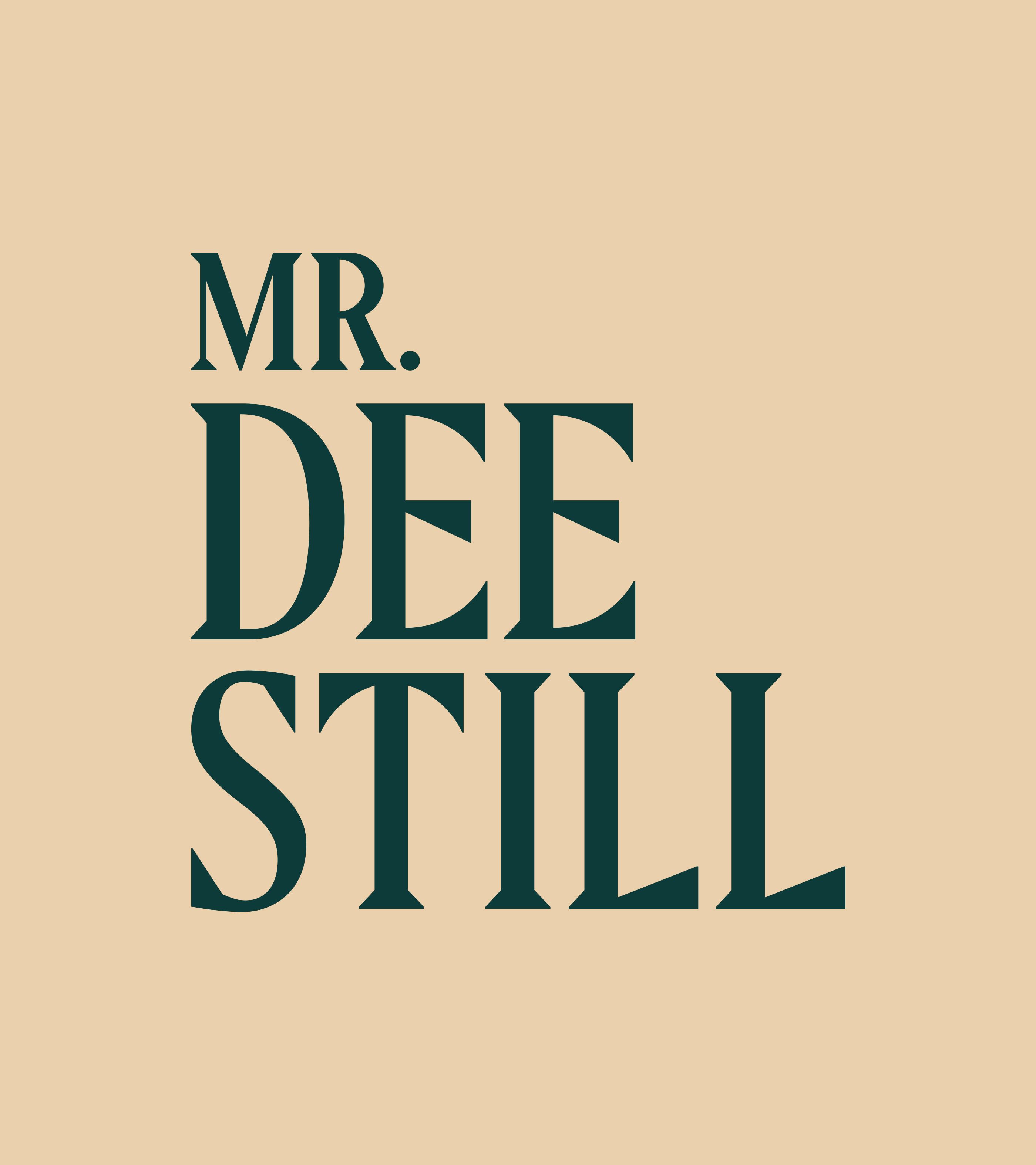
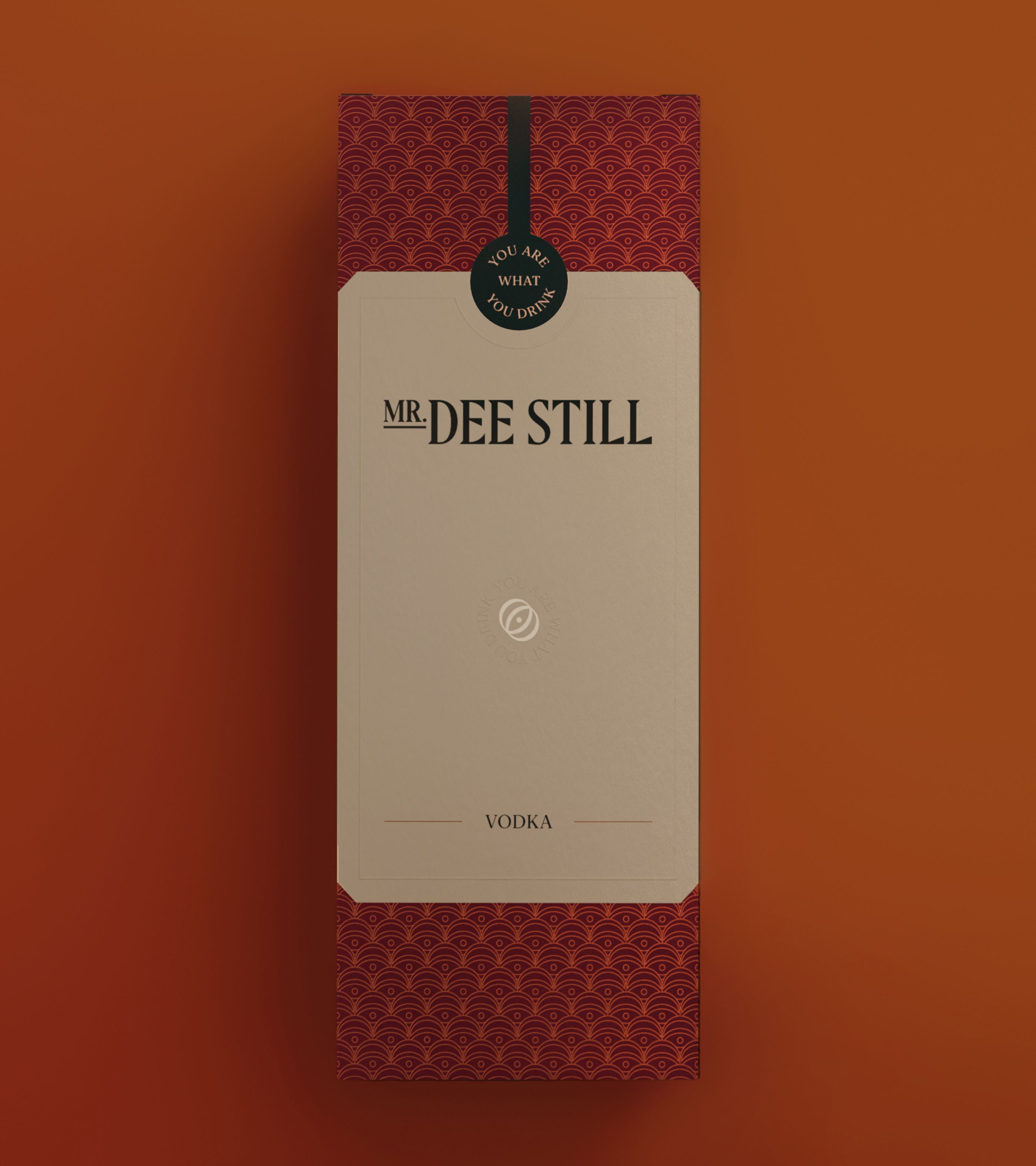
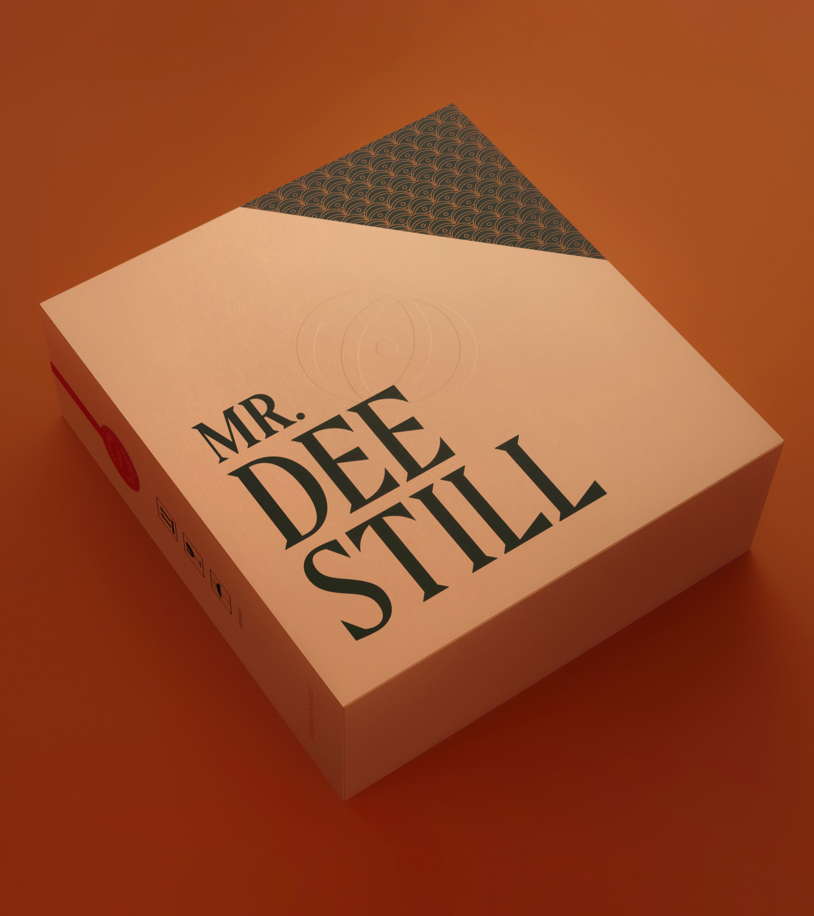
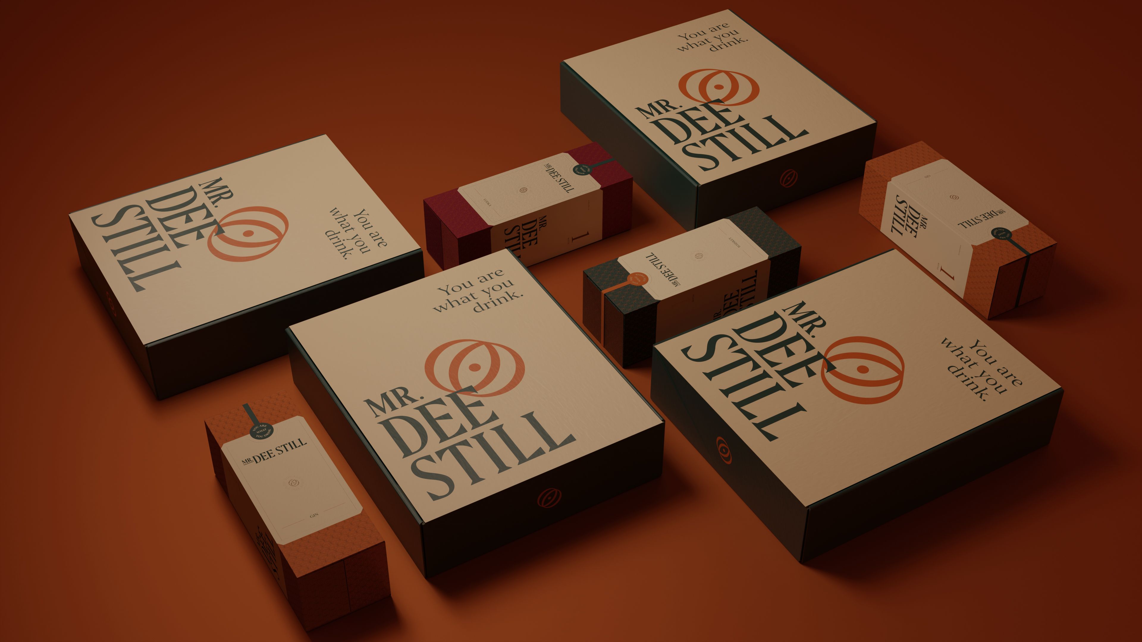
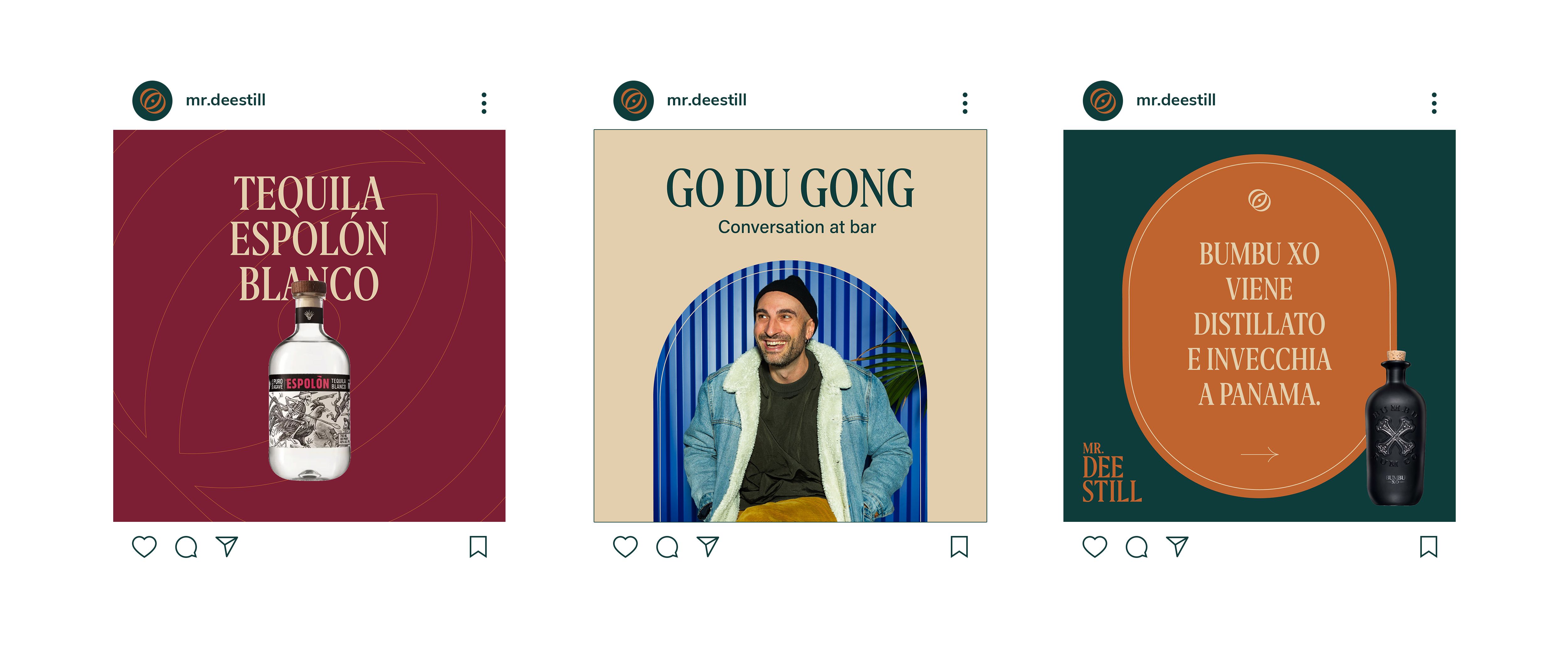
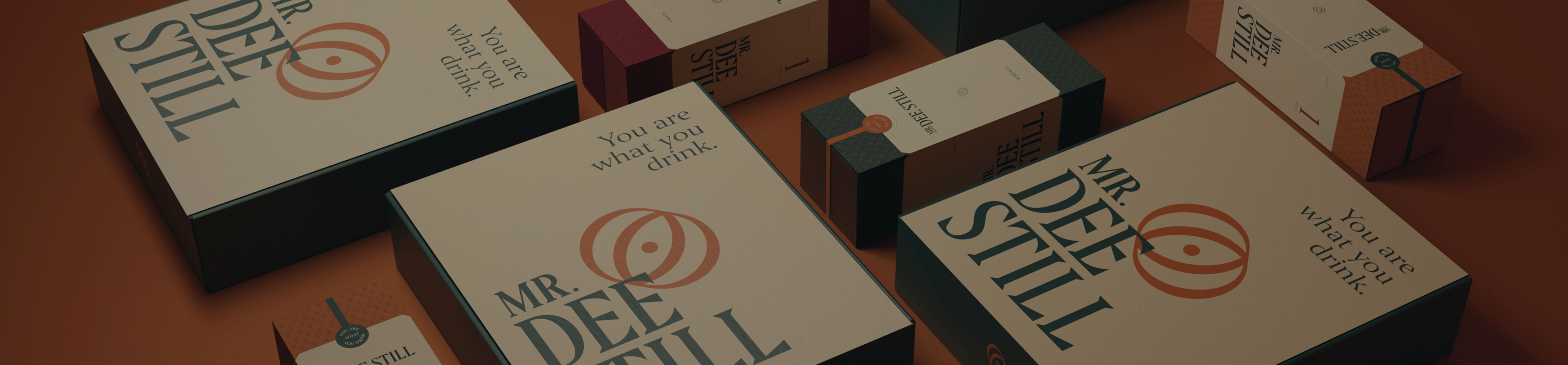
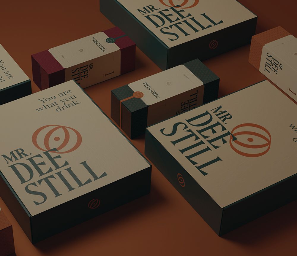
Mr. Dee Still

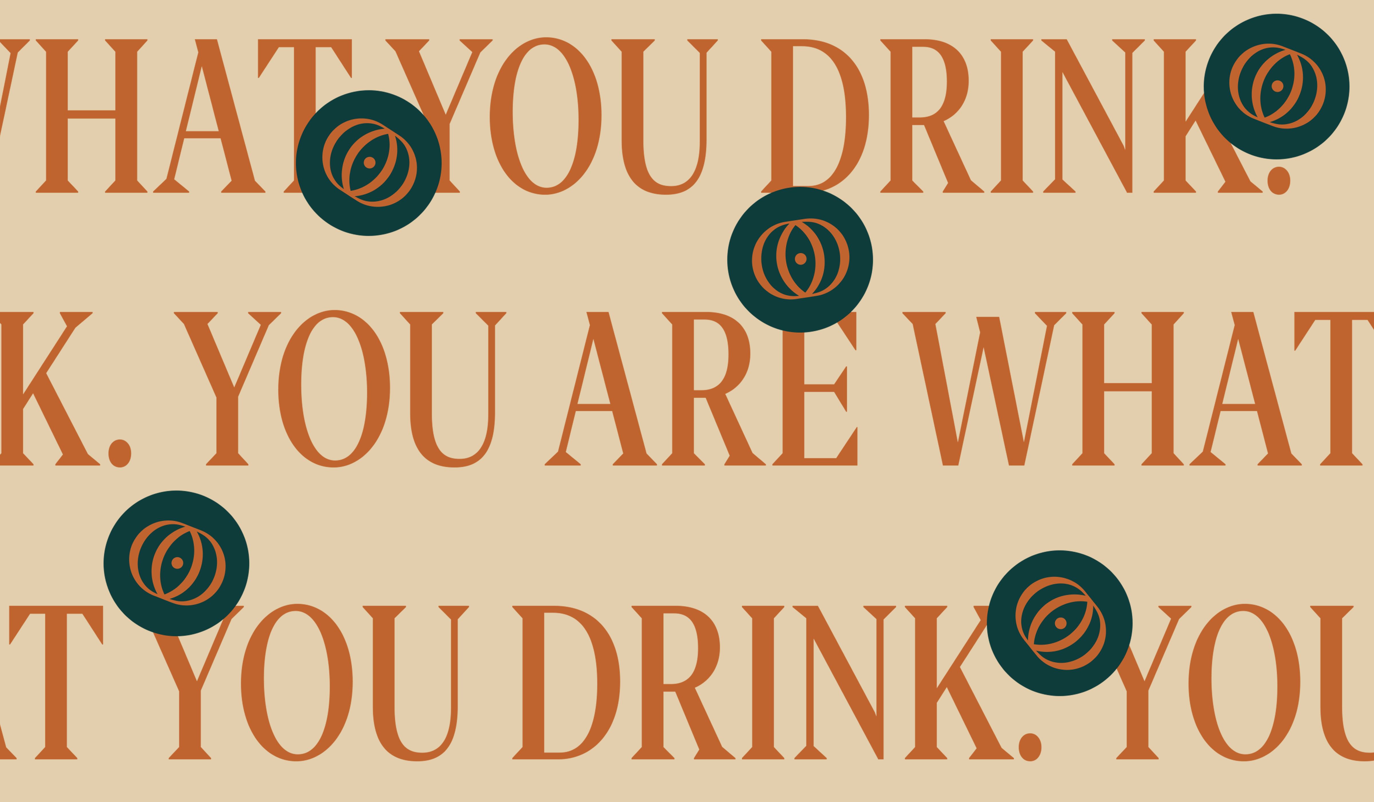
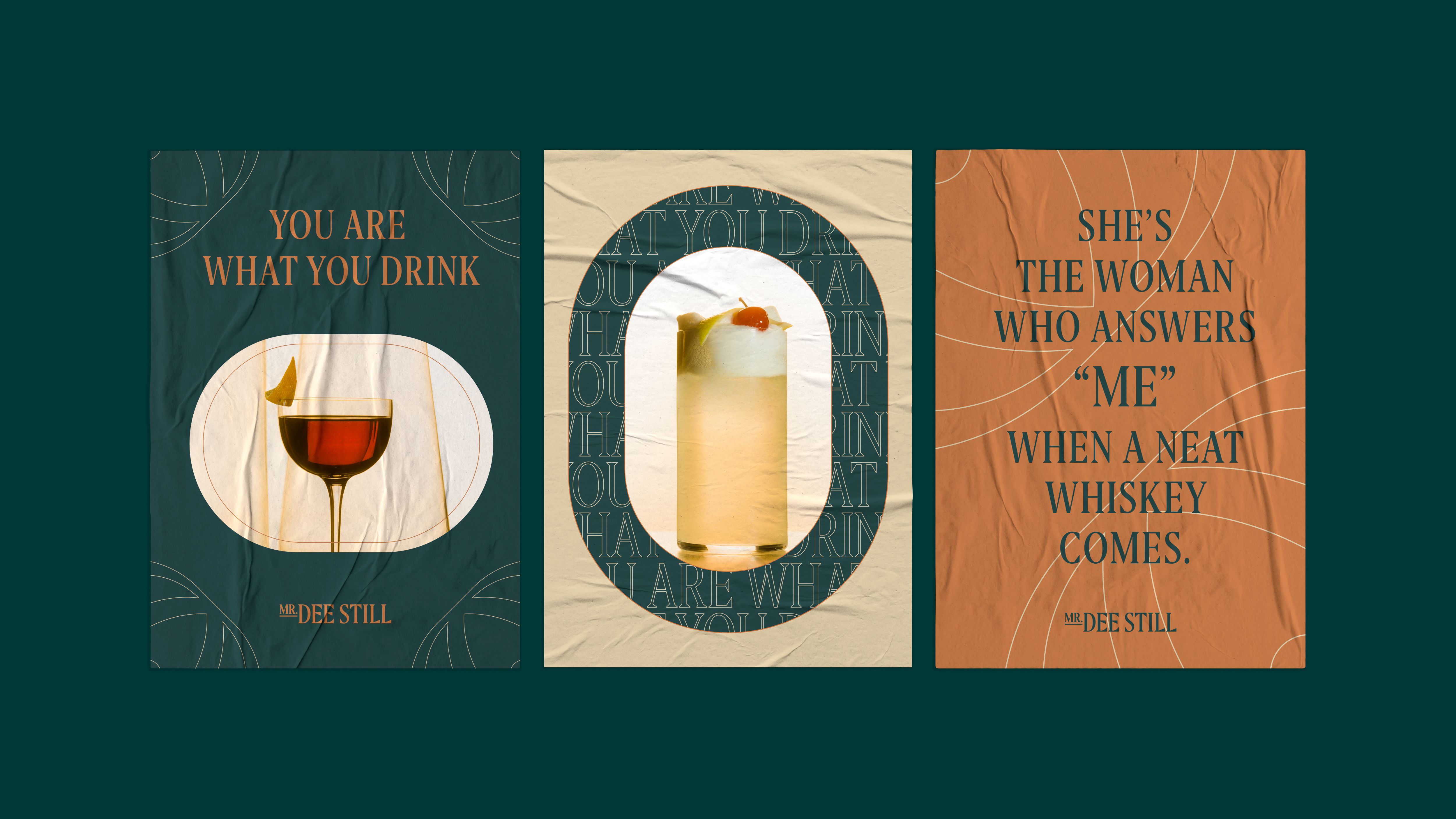
You are what you drink

  • Branding
  • Graphic Design
  • Digital

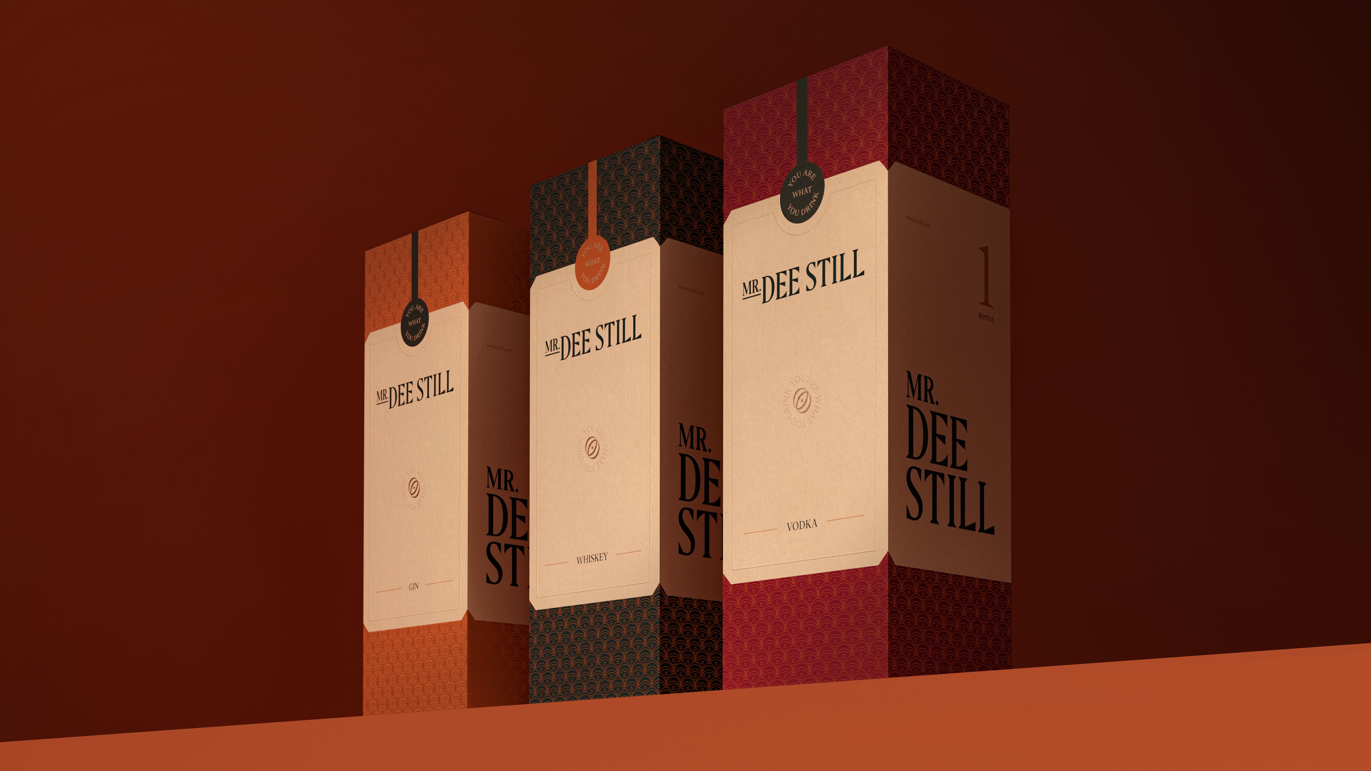
A new visual identity for Mr. Dee Still (shaken, not stirred).

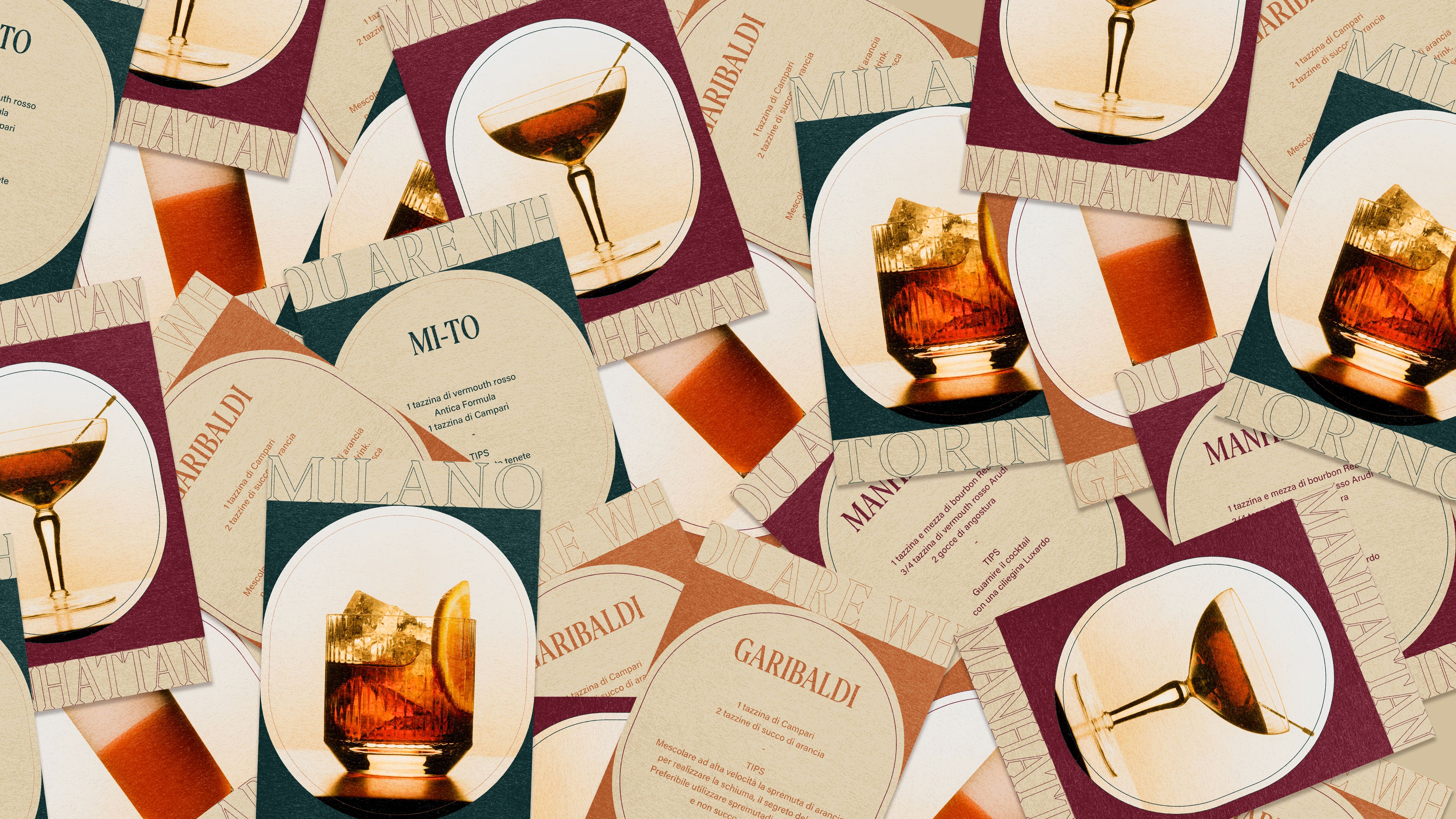
Mr. Dee Still is the shoppable magazine dedicated to the world of beverages. Its aim is to spread the stories of spirits' producers, suggest the most important cocktail bars in the world and highlight the trends, making consumers more aware of their consumption of beverage products.

A glass always full.

For its corporate identity, we decided to draw on the imagery related to the world of Prohibitionism. The graphic symbol that drives the identity is the mark, representing a glass seen from above, in perspective. The addition of the central dot gives a double meaning to the new symbol, which also becomes an eye, symbolizing the curiosity in the discovery of spirits.